Author: Cole Stanton

In this installment from MasterWorks, let’s explore another unique strength of ICP at the crossroads of color, design, architecture and history: our Historic Colors of America and 20th Century Colors of America systems. Combined, these two palettes offer the most comprehensive and accurate system for historic colors used across almost three and a half centuries of our built environment in North America. In the future we will report on the 20th Century colors. For this edition, the focus is on the colors from the 1600s up to the advent of the 1900s which are found in our Historic Colors of America.
For preservation of historic and heritage buildings, the value of these tools is self-evident. Increasingly, a wide range of owners, managers, contractors and designers are also discovering this resource unique to ICP for remodeling and restoring irreplaceable properties. Presently, far more of our color requests from architects and designers are for samples from the historic collections than any other system, and this growth is accelerating. In part this is due to greater awareness as more structural professionals join the ICP MasterWorks Community. It is also trending up because ICP users are adapting our historic colors not just for California Paint, but as well for new brands such as APF, Scuffmaster, Pli-Dek and Fiberlock.
For example, APF is well suited to doing custom colors and color matching as they make their own colorants and have a color lab on site. Adding a historic palette to their resources augmented an already strong skillset with custom matching. In Eagan, MN, the Scuffmaster team also welcomes the opportunities afforded by customers with historic special color needs; Scuffmaster will match any color for you with no upcharge and no minimums required.
Note one caveat is that Scuffmaster’s metallic products (Solid Metal and EnviroMetal) cannot match bright whites. The metallics start out as a straight silver – we can tip the color from there but we cannot lighten it. For a Historic Color in a sparkling or glistening Scuffmaster product, check out Scuffmaster’s finish Smooth Pearl.

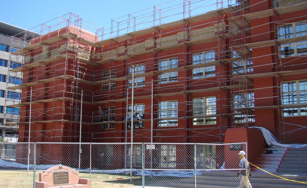
Fiberlock’s ability to match these Historic Colors is especially important for the lead paint encapsulated with LBC Lead Barrier Compound. The benefit of getting a historically accurate color and compliance with the lead laws simultaneously is extremely attractive to both architects and owners.The Las Vegas Academy High School encountered just this while needing repainting and discovering that it contained both asbestos and lead based paint. After over 70 years of exterior paint jobs, they wanted to get back to authentic color and make the architectural detail a prevalent feature once again. Check out the case study, here.

Starting With a Historic New England Partnership
I grew up in Boston, and like many was spoiled by the rich history including an architectural legacy bestowed cumulatively since the 1600s. And like many of us, I was fooled early by the dignified shades adorning the Georgians, Federals and Victorians in the cities, leafy suburbs, and bucolic farms of New England. Snow white muntins and mullions of double-hung wood windows were an expectation. I thought fair and quiet body colors accentuated by contrasting and conservative dark trim was status quo, but it turns out that was stereotype. From those 1600s saltboxes through the post-moderns of the 1970s, there has been a liberal use of color, and in some eras (e.g., like the Victorian) a rollicking spectrum of paints used inside and out. What did the colors of the past actually look like? Turns out that for many years historians mistakenly assumed that the colors of the past were somber and muted, based on colors found when modern paints were scraped away from old surfaces. However, modern scientific paint research has gradually discovered a vivid palette and surprisingly flamboyant combinations.

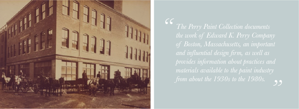
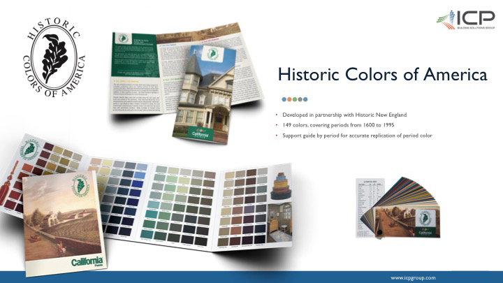
The advancement of accuracy and accessibility of historic color took a quantum leap forward with the development of the Historic Colors of America as a joint venture of California Paints and Historic New England – the oldest and largest regional heritage organization in the nation. Founded in 1910, as the Society for the Preservation of New England Antiquities (SPNEA), there could be no better partner to collaborate with in search of truly authentic hues. In conjunction with their conservators, curators, and historic architects, a team assembled by our California paint organization over several years analyzed thousands of historic colors to accurately represent the last three plus centuries. Some colors were rediscovered from the society’s 123,000 objects and 1.5 million archival materials that chronicle life in the Northeast since the seventeenth century. This included the singular Edward K Perry paint archive. The Perry Paint Collection revolves around the accrued content of the client showroom (the ‘Sample Room on Newbury St.) of the Edward K. Perry Company of Boston, an important and influential design firm of the 20thcentury. This collection provides colors, as well as information about practices and materials available to the paint industry from about the 1930s to the 1980s.

But the effort wasn’t only archival. The collective effort was extended to the collection and analysis of hundreds of samples from real historic sites. Historic New England leveraged their knowledge of candidate sites with probable value for research. California Paints conducted forensic examinations to descend into field samples of paint, layer by layer, to identify and isolate lost colors and establish their provenance for now and preserve it for the future. Sometimes samples came not from buildings but from contents from folk carvings to elegant corner cupboards. These objects supplemented the research on interior colors which in past eras featured bold colors in homes. The combination of brilliant woodwork colors and vibrant walls brought rooms alive.
Turning Research Into an Unprecedented Tool
The Historic Colors of America is organized by architectural era. Some of the earliest pigments, in relatively humble hues like Farmhouse Ochre and Codman Claret, are included in the Colonial section that houses the mid-1600s to about 1780. Colonial architecture in this context can be thought of as structures based on the traditions and preferences that European settlers knew from their ancestral cultures and tastes. Original Colonial styles were built primarily along the east coast (dominated by the the classicism of Georgian England), gulf coast (think St. Augustine and Spanish florida) and portions of the southwest with the renowned Mission and Spanish Baroque traditions. They were built before the era of industrialization, and unaltered examples have a characteristic “handmade” quality in such details as doors, windows, brickwork or siding. The most characteristic Colonial house is usually a one or two-story box, two rooms deep with symmetrical windows.

The Federal style was the dominant style of the new Republic (1780-1830). During this period the population tripled in size and expanded to the west and south. The style was mostly concentrated in prosperous port cities of the eastern seaboard in Massachusetts, Rhode Island, Maine, New Hampshire, Pennsylvania, New York, South Carolina and Georgia. Diversity of spatial planning found in interiors of the period reflected the style of Robert Adam, the gifted English architect who also popularized design elements such as swags, garlands and urns. Symmetry, lightness and delicacy characterize the Federal or Adam style. One of the earliest examples of this style was the ceiling in the Mount Vernon dining room, executed for George Washington in 1775.
In general, Federal houses may be rectilinear and boxlike, with perhaps an elliptical fanlight over the front door and sidelights flanking the door. Door trim may include thin columns or pilasters and curved or octagonal projections may reveal the shape of interior rooms. Also characteristic are curving steps and windows recessed within arches. The roof is oftenconcealed behind a balustrade.
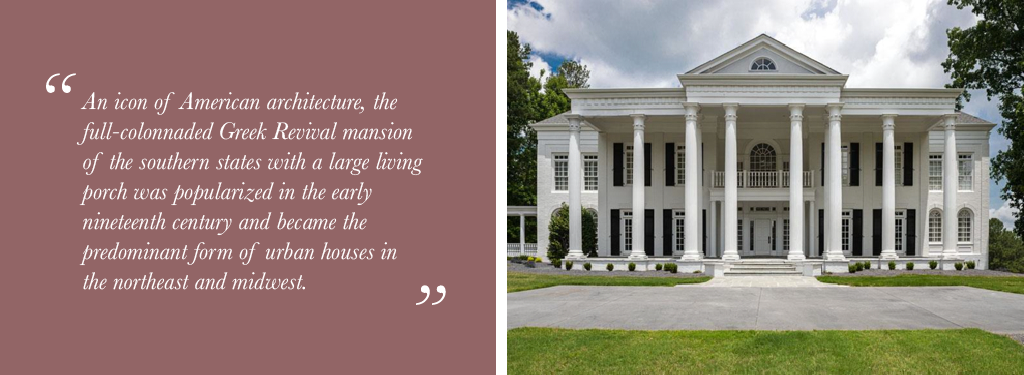
From roughly 1825-1855, The Greek Revival period began and ended in this country with public buildings built in Philadelphia. One of the most familiar icons of American architecture is the full-colonnaded Greek Revival mansion of the southern states with its large veranda or living porch. The front-gabled house was popularized in the early nineteenth century and became the predominant form of urban houses in the northeast and Midwest well into the twentieth century.

The classical temple form with a portico across the entire front and the roof ridge running from front to back is employed for buildings of all kinds and sizes including cottages. Dormers are rare and roofs are generally gabled or of low pitch. The front door is typically surrounded by narrow sidelights with a row of transom lights above. The most common types of ornament are the anthemion and the Greek fret, wide pilasters and deep, heavy cornices. Wooden buildings were invariably painted white.
For the balance of the 19thcentury, the styles that were popular during the long reign of Britain’s Queen Victoria are generally referred to as “Victorian.” Growth of railroads and industrialization led to changes in mass productions and shipping of house components, while the development of mechanized saws and lathes led to a profusion of wooden ornamentation. The extravagant use of complex shapes and elaborate detailing are clearly reflected in these landmark houses.
Late Victorian styles of this period, also known as “Stick” and “Queen Ann,” became intertwined and tend to overlap each other. Characteristics such as multicolored walls, asymmetrical facades, and steeply pitched roofs are common features. Dwellings were built with every conceivable type of trim including wooden lacework, patterned shingles, porches and towers with conical roofs. Roofs are often complex with cross gables, conical turrets, dormers and decorative brackets beneath eaves. Finials and crestings were frequently used to decorate the roof ridges.
Accessing These Color Tools

To start browsing the historic selections, you can certainly visit a California Paint retailer that participates in this program. But ICP has made it convenient to get started online. Several of our color systems can be explored via our Digital Fan Deck available at https://www.californiapaints.com/find-my-color/. Select the drop down menu, and choose either Historic or 20thCentury. Then find colors for the era of interest. For example, if the building is in the Art Deco style, there are 38 colors in the 20thCentury Colors of America system from that period, from Bahaus to Emerald City to Gatsby Gold to Urban Brick. Of course, colors on electronic screens are just an approximation. Color samples on cardstock are the next step, and are made available at no charge. To send a request, take note of the preliminary color choices, and use the Digital Fan Deck’s companion order form (seehttps://www.californiapaints.com/find-my-color/color-chip-order-form/), or email requests to specifications@masterworks.com. Please note that some seasons the volume of requests can surge, and it can take 7-10 days before color chips are processed and sent to US and Canadian addresses.
Want more?
From Historic New England, Here are some resources helpful when thinking about historic paints:
Moss, Roger W., ed. Paint in America: The Colors of Historic Buildings. Preservation Press: Washington, D.C., 1994.
Nash, George., Renovating Old Houses. The Taunton Press: Newtown, 1998.
Weaver, Martin, E., Conserving Buildings: A Manual of Techniques and Materials. Preservation Press: New York, 1997.
Weeks, Kay D., and Look, David W., Preservation Briefs #10, “Exterior Paint Problems on Historic Woodwork.” National Preservation Services, National Park Service: Washington, D.C., 1982.
We would love to hear from you about experiences and product needs you see across this burgeoning industry. Watch for some new LinkedIn discussion groups, and we invite you to send emails to the MasterWorks team at MasterWorks@icpgroup.com.


